BonusX 🏆
Project: BonusX Feature
Goal: To boost insurance agents' motivation and engagement by gamifying the tracking of individual and team performance towards bonuses and benefits.
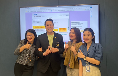
Role: Senior UX/UI Designer — sole designer responsible for research, design, and stakeholder alignment
Tool Used: Figma
Duration: Dec 2023 - Jun 2024 (7 months)

What are the problems here 🔥
Problems
-
Insurance agents struggle to track their sales performance, leading to missed bonuses and benefits
-
Lack of progress visibility reduces agents' motivation and team drive
-
Agents frequently call the call center for status updates due to inadequate tracking tools
UX Challenges
-
Understanding the complete structure of sales agents and their benefits within a limited timeframe
-
Designing and executing comprehensive design systems single-handedly, while addressing business needs, legal requirements, and resource constraints
-
Implementing a real-time dashboard and tracking system with gamification elements to motivate sales agents and boost their performance
Note: As the sole designer embedded in a business team, formal post-launch analytics were not within the project scope. Outcomes are based on qualitative feedback gathered directly from agents and stakeholder observations post-deployment.
Meet our users 💙


I conducted in-depth interviews with sales agents at all levels to gain insights into their current tracking methods and identify pain points. This research focused on understanding what motivates them to make sales. Based on the findings, I developed two personas: a sales manager level and a typical sales agent.
Defining the Design Direction 💡
After thoroughly understanding the bonus and benefits structure, I developed the information architecture to organize these benefits for each agent level. This structure was divided into two main groups: bonuses from individual sales and bonuses from team management.
The image below outlines all the bonuses that need to be designed. Each bonus comes with its own set of logic and conditions, including timing, payment, and requirements.


In the design phase, I researched several apps that use gamification to evaluate and adapt design ideas for the bonus tracking and sales motivation screens.
I began drafting wireframes of each bonus page (30 bonuses) based on the specific needs of the personas and insights gathered from user interviews.
I scheduled a meeting with the data team to verify the feasibility before conducting usability testing.

Usability Testing & Iteration 📝
As a UX designer, I started by creating a list of usability testing questions for each individual bonus screen.
This was done to ensure the designs addressed user pain points, encouraged motivation and tracking, and offered a user-friendly interface.
Here are some examples of the first usability testing questions I asked the insurance sales agents to gather design feedback:
-
On this screen, what is its purpose? What actions can you take here? What aspects do you appreciate or find challenging about it?
-
What steps are necessary to fulfill the mission?
-
Can you explain your understanding of this particular element?
-
On a scale from 1 to 10, how well do you grasp the content, and why did you assign this rating?
-
Please offer suggestions on how to enhance this screen to better meet user requirements.

Finding Patterns 👀
After interviewing 7 real users, I collected all the information and organized it into an affinity map to find common problems. This helped me understand the issues better and come up with new design ideas.
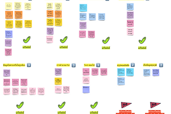
Affinity Map - Dashboard


Affinity Map - Overriding Own Unit
After identifying patterns and design problems from the affinity map, I adapted the feedback to refine the designs. I then collaborated with the data team to verify the feasibility of these changes.
Next, I developed new designs incorporating various use cases in preparation for a second round of usability testing, which emphasizes on asking if users prefer the revised design to the first design.
Final Screens 🎉
Here are some examples of the designs before and after the improvements.
Before usability test (First Draft)

Commission Page (Before):
The design allows users to set goals and compare first-year and second-year policies over time.
After 2 usability tests (Final Screens)

Commission Page (After):
Users prefer viewing policy details over setting goals, as tracking status is more important .

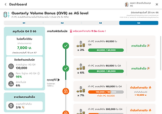
Quarterly Volume Bonus (Before):
Users were unaware of their current status, unable to focus on tracking their tasks, and confused about how bonuses were calculated.
Quarterly Volume Bonus (After):
The summary data is grouped in the left panel for clearer communication, while the progress bar helps visualize task completion.


Recruiting Bonus (Before):
Users couldn't see the current tracking period for their downlines, and some found the data overwhelming.
Recruiting Bonus (After):
Users with many downlines can hide or expand information to reduce scrolling, with the current month highlighted for easier summary.

Overriding Bonus (Before):
The design lacked proper hierarchy, causing users to struggle with focus. They also had to complete prior tasks before addressing the current mission.

Overriding Bonus (After):
Data is prioritized to highlight current info and missions, with future missions displayed so agents can track and not miss bonus opportunities.


Elite AL (Before):
The screen didn't show the status clearly and since this type of bonus pays quarterly, users didn't know which number results from completed past or current mission.
Elite AL (After):
The summary tab helps users track easily between current and future achievement. The mission are listed clearly of what to do with each conditions.


Dashboard (Before):
Users find the bonus summary graph confusing to interpret. Mini versions of each bonus could better display enough information for quick understanding at first glance.
Dashboard (After):
Instead, displaying the progress bar immediately encourages users by showing their achievements. The mini version highlights the bonus amount, which is the user's main focus.
Extending The Design System 🎨
The Challenge
Allianz operates from a global design system not originally built for the AZD app's specific use cases. As new features required UI patterns that didn't exist in the global library, I was responsible for extending it — creating new components that maintained visual consistency while meeting local product needs.
What I did
-
Audited existing global components to identify gaps for new feature requirements
-
Designed new components (e.g. gamification progress bars, bonus status cards, collapsible data rows) that didn't exist in the global system
-
Documented usage guidelines and states (default, active, disabled, loading) for each new component to ensure developer handoff clarity
-
Ensured all new components followed existing token structure (color, spacing, typography) for visual consistency


Project Launch 🚀
BonusX launched to 120,000 agents in July 2024 — the largest feature deployment in the app's history. Agents who once called the call center for bonus updates could now track everything independently. Feedback collected post-launch confirmed the feature addressed the core pain point it was designed to solve.
As the sole designer on a business team, formal analytics were outside the project scope. Outcomes reflect qualitative feedback from agents and stakeholders post-deployment.
Check out the promotional clips for "BonusX" below!
What I learned 🏆

Complexity is a design problem — 30 bonus types, each with unique logic. The challenge was making it feel simple.
Early validation saves rework — Collaborating with developers and QA before usability testing caught issues before they became expensive.
Leading without a title — Guiding stakeholders toward user-centered decisions through clear reasoning became one of my most relied-on skills.