
Project Vision
Memost is the client management app for photographers which helps photographers find the right client and be able to manage the clients at once through the app.
Our goal is to understand in-depth of the photographer's experience towards their job challenges and client management in order to design the app feature that provides the best user experience.
Challenges
1. Solve users pain points of getting and managing the clients
2. Design a cohesive interface for users as well as accessibility support
3. Sync all essential features to support the use of the app

Starting Point
I'm creating a new app that helps match the photographers with their potential clients to fulfill their job opportunity. Therefore, I need to know if the app is easy to use and practical as well as if users find it useful and face any challenges while using the app. I did some user research with a qualitative research methods and competitor analysis. So I came up with some initial research key questions.
-
What can we learn from the user flow for photographers to match the potential client?
-
What do users (photographers) expect and need most?
-
Are other client management apps useful and easy to use?
-
Are there any room for improvements to enhance a better UX?
Meet The Users
After interviewing the photographers with many different backgrounds, I came up with two personas.


Competitor Analysis
I compared with other client management software features and three of them are direct competitors.
Most of them have strong brand identity and basic features. However, some gaps that I identified include:
-
English is the only available language for all apps
-
Most apps don't have a search bar for quick search
-
Most of the brands don't allow full customization
-
Most of the brands have poor performance on mobile app
-
None of the competitors provide client matching features

_jfif.jpg)


Planning The Journey
As the goal is to let users get the client by matching their conditions with the clients, I created a user flow from starting to finish and this helps me understand better how users interact with the product and well as designing the proper navigation.

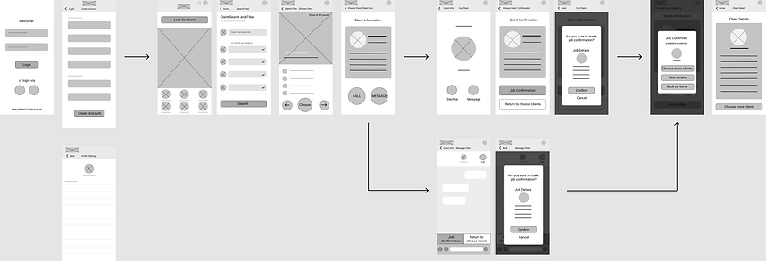
Wireframes
While sketching paper wireframes, I think of many possible best layouts and functions that will help address users pain points. The low-fidelity wireframe demonstrates the user flow from login to client confirmation process. This will later be developed further in usability test session.

Low-Fidelity Prototype
.png)
Feedback From Usability Study
After making a low-fidelity prototype, I conducted the round 1 usability test with 5 different participants and asked them to complete the tasks in order to gather feedback of using the app. Then I created an affinity diagram, identified patterns and came up with some insight identifications.
-
The design flow of the chat feature and job confirmation needs to be revised.
-
There is no feedback after making a job confirmation.
-
The position of the search tab looks confusing.

Which later after revising the high-fidelity prototype, I also conducted the round 2 usability test as well as created another affinity diagram and came up with the findings.
-
There must also be a feedback from a currently confirmed client.
-
The search result page needs to be redesigned.
-
Users are confused with job confirmation feature after making calls
High-Fidelity Prototype
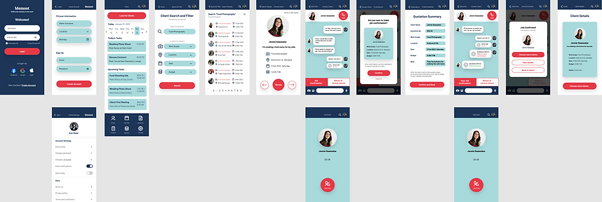.png)
Before VS. After Usability Study

Users are confused of choosing between call and message feature as well as which way to do job confirmation.
>

Users are only redirected to message feature but can choose to make call via message feature and can do job confirmation via message only.

The search results are shown individually which users can choose one by one.
>

The search results are shown in overall list according to the search filter so that users can skim through many clients at once.
Beat The Challenge
Challenge 1
Solve the pain points
The search filter will help users match their potential clients effectively by letting them fill in their conditions of work scope, location, date, and budget.

Challenge 2
Clean and easy to use interface and accessibility support
The interface is designed to have a direct and simple user flow. Users can navigate easily to meet their goals. As well, the app also supports the accessibility conditions by providing choice of language and having the contrast checked via WebAIM.

Challenge 3
Provide an all-in-one app to support the users
The app contains all essential functions and features to help support the users from help finding the client until closing the job with the clients.

Style Guidelines
As a brand I chose the color palette that represents modern and reliable concept as the blue tones with the red accent to emphasize the buttons. The round corner elements gives users a friendly feeling.

Next Steps
After conducting the second usability test, I’ll improve the UX design of the hi-fi prototype and make another usability test to checkout if there's any room for improvement with it to enhance a better UX design.
Prepare to study more about the responsive design so that I can redesign this app to be able to use with the tablet and on computer screen.
Key Takeaways
As my first project of UX design and research, I learned that great designs come from great procedures. Following the steps of the UX process and understanding the users are very important. Though the designs came out, the need of continuous improvement is still needed to enhance a better UX.